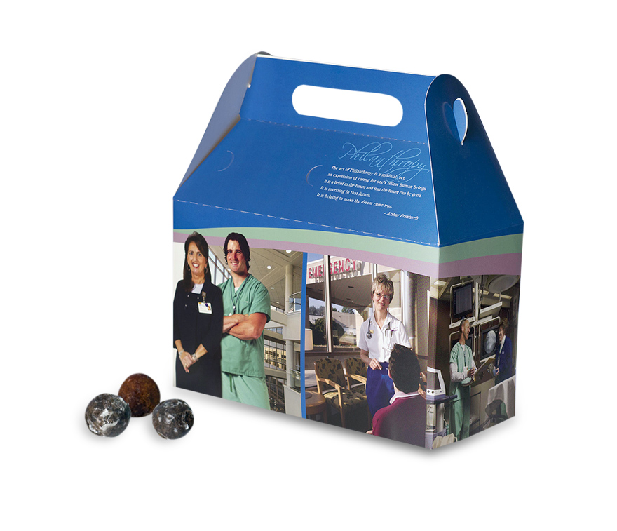
big box story
The donor-branded doughnut boxes symbolize so much about accent’s long-term relationship with St. Mary Foundation — it’s literally about thinking outside the box. The doughnut box is given to donors on their or their loved one’s hospital admittance. It says to them, “We appreciate you.”
The box isn’t filled with chocolate glazed or jellies, but crossword puzzles or books. It’s been the Foundation’s willingness to try innovative approaches that’s defined our relationship since 2000. And we have launched many of their firsts, including the colleague campaign, interactive DVD, newsletter, comprehensive campaign and more. Yet, we have a partnership built on more than just firsts — it’s one that’s thrived on never being boxed in by tired ideas.
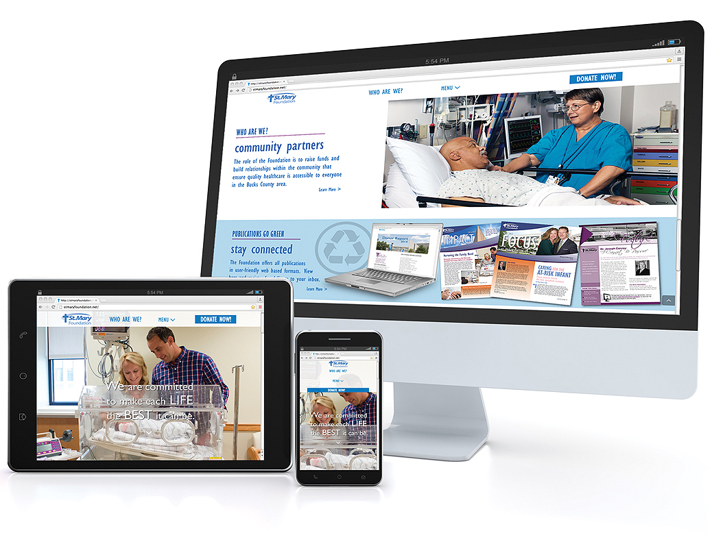
untangling the web
We designed the first St. Mary Foundation website in 2007 and rebranded it again in 2016. After we completed the on-site training, Foundation staffers have kept the site current. Our ongoing relationship is twofold: We provide backend support and maintenance to keep things running smoothly and coding for blogs, comment sections and more when new needs arise.
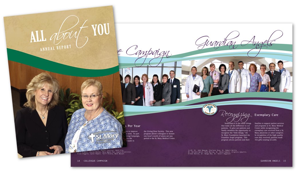
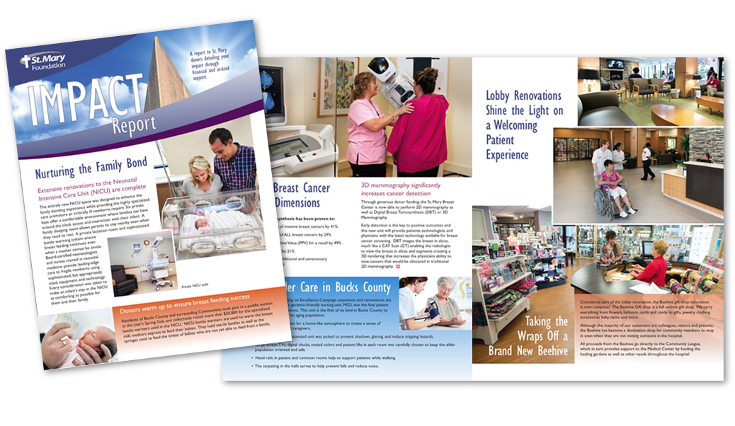
Staying connected to the community is vital for St. Mary Medical Center, especially in an increasingly competitive health care landscape. With people pulled in so many different directions, the annual report is a crucial tool that shows the ways the Foundation keeps the community strong.
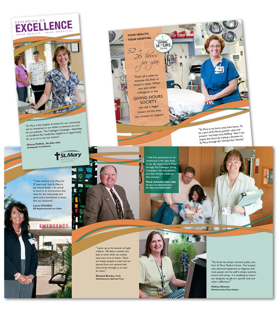
accent researches, writes and photographs compelling stories that show neighbors helping neighbors and how these relationships affect real change. We never use stock images because our brand initiative for the Foundation is to show that St. Mary Medical Center is not just a part of the community, it’s the heart of the community. We chose people who use or have used St. Mary Medical Center’s services, and we tell the stories of how these ordinary people had extraordinary outcomes because of the hospital’s commitment to them.
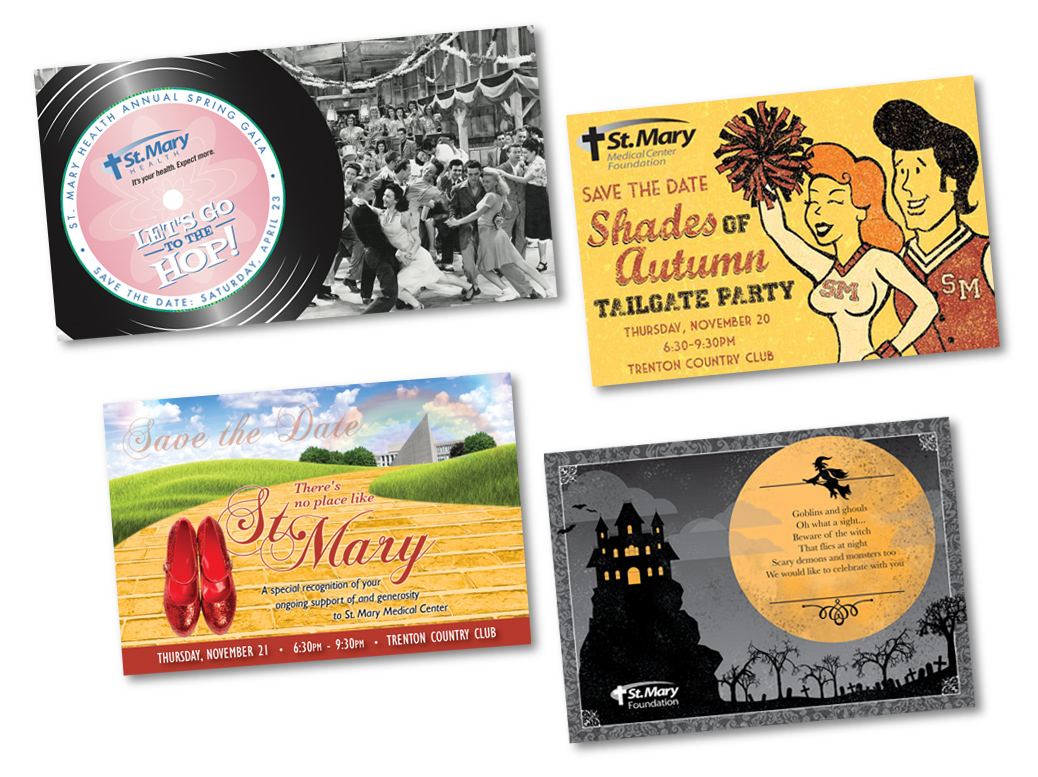
The Foundation has a reputation for staging some of the most elaborate donor fundraising events in the region. accent works behind the curtain to make the one-of-a-kind visual themes for these events come alive. Our original artwork, all drawn freehand and colored in Adobe Illustrator, takes the collateral material to buzzworthy heights. From flying witches to a yellow brick road, our graphic concepts are spellbinding and inspired, giving every event a mystique that’s part of the fun.
The donor impact report is the most critical publication showcasing the philanthropic year in review. But the list of donor names in the traditional, printed publication became unwieldy. With so many generous people to acknowledge, the exhaustive search to find one name among thousands — in addition to the escalating printing costs — began to take its toll. accent had a solution: Create an online, interactive search-by-name feature that also allowed for instant updates and additions. We spearheaded a valuable resource that’s fast, easy to use and cost-effective.
Launch Interactive Impact >
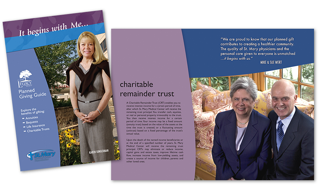
accent’s planned giving strategy included writing and photographing a user-friendly guide to explain complicated giving opportunities involving bequests, life insurance and charitable lead trusts. Our copy writing team broke down each topic into easy-to-understand language, using real donors to show how their families played a part in the Foundation’s future.
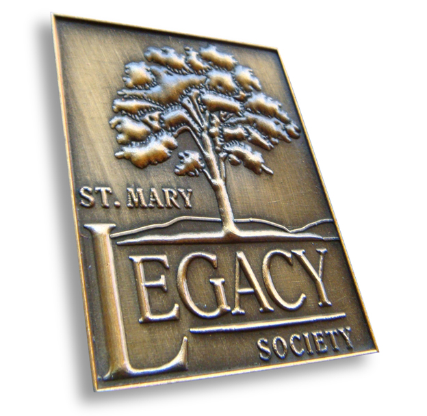 pinning ceremony
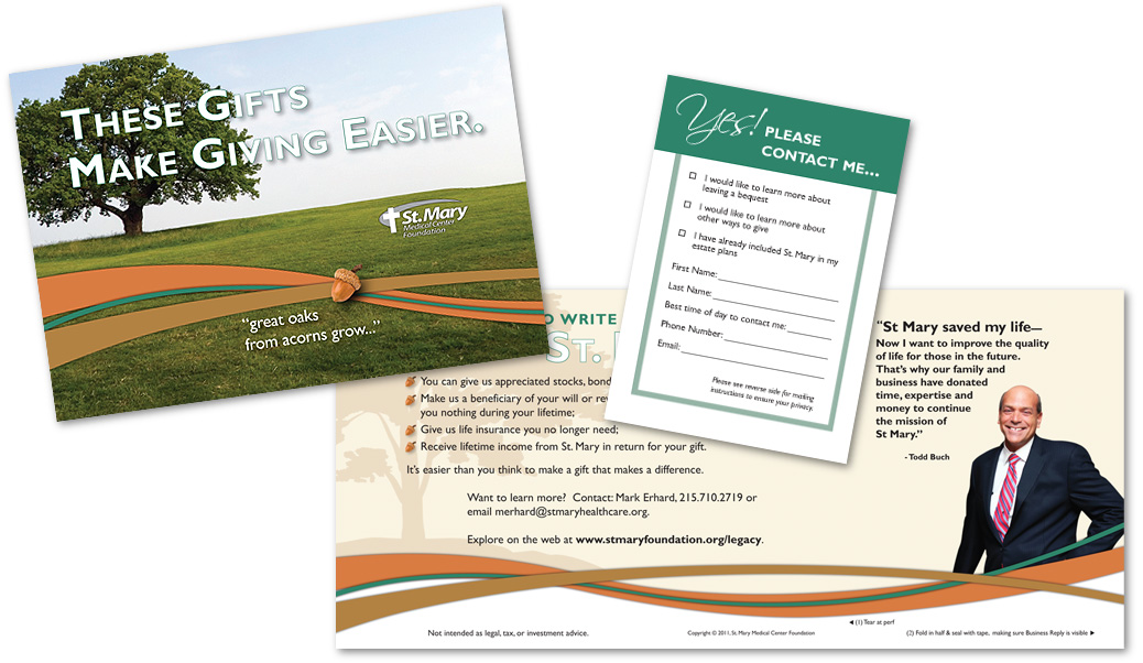
We also created a logo — the St. Mary Legacy Society — for donors who made a planned gift to the Foundation in their wills. A bronze pin was given to members that was built on an oak tree graphic that represented the proverb “great oaks from little acorns grow.” The idea that a big impact comes from a small beginning that grows stronger over time and provides comfort to future generations ties into long-term planned giving. This has become the signature visual used for events and collateral mailings.
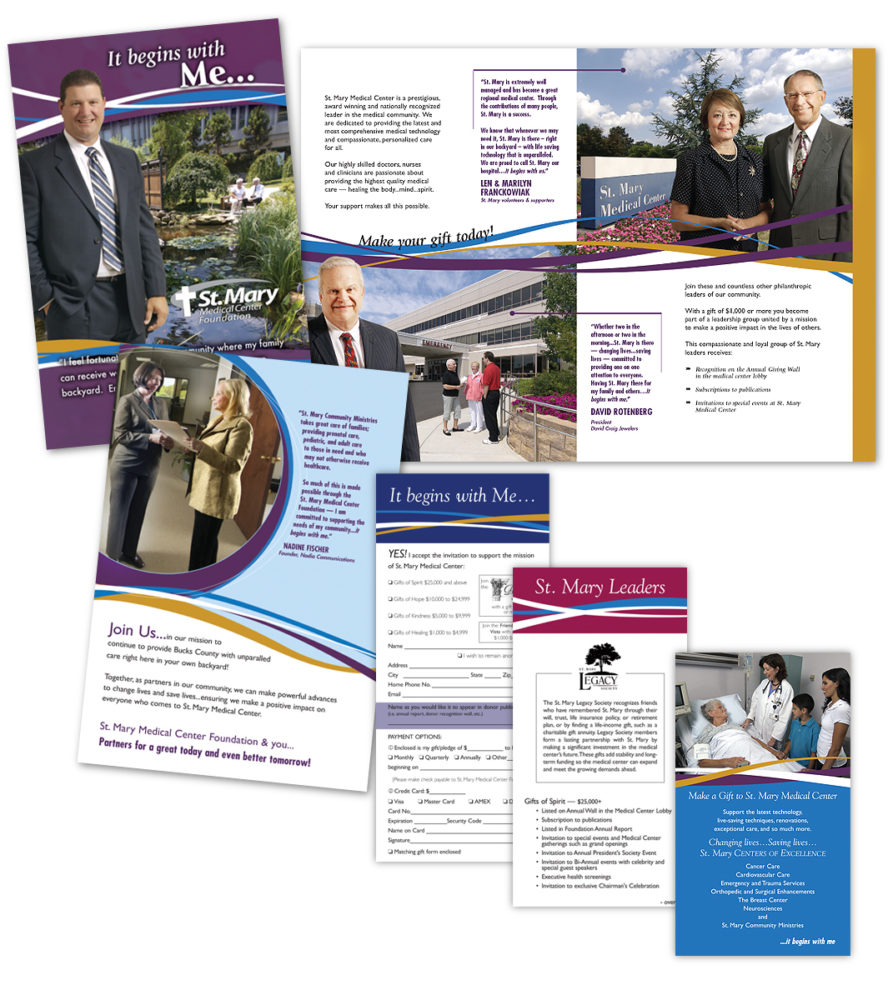
accent wrote and photographed a pocket folder designed to be a leave-behind after meetings with donors. It outlined the opportunities to partner with the Foundation to make a difference. We highlighted real donors who were also community members and included their impassioned quotes about why and how giving was important to them. The writing was concise and straightforward, easily summarizing the giving societies, while also including a matching pledge card to begin a donor partnership.
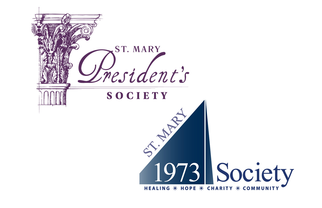
Creating the right look for any organization is no easy task — including a giving society — as it can make or break all that follows. Names and graphics must come together to be identifiable, evoke the desired emotions and reactions, and send the right message so they can live on for years to come. Like we said, it’s not easy, but our team does it without breaking a sweat. In addition to our work on the St. Mary Legacy Society, accent branded both enduring images for the 1973 and President’s societies.
pillars of strength
The President’s Society was created for annual gifts of $5,000 or more. We graphically represented this Society with a Roman column to signify how these generous donors were “holding up” the good works and future of the Foundation.
statements of grace
For the 1973 Society for gifts of $1,000 to $4,999, we showcased the triangular beauty of St. Mary Medical Center -Chapel, which was one of the first buildings built on the Medical Center campus in 1973 and is easily one of its most recognizable. A focal point for any driver in scenic Bucks County, the accent team acknowledged these gracious donors with a beloved, pivotal and unforgettable landmark — which is exactly how the Foundation sees its 1973 Society donors.
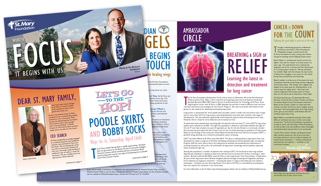
Tasked with communicating with the Foundation’s diverse donor base with one quarterly newsletter was a challenge accent embraced. As this was the main branding publication, accent chose a tabloid size to get noticed. We used large photos, headlines and a fresh, modern color palette to capture readers’ attention. Our layout was then easily translated to the web.
Building from the brand look we created for the Foundation, we wanted readers and users to become familiar with this publication by creating regular, recognizable sections. We also developed an interactive version that was emailed to those who opted in.
view issues:
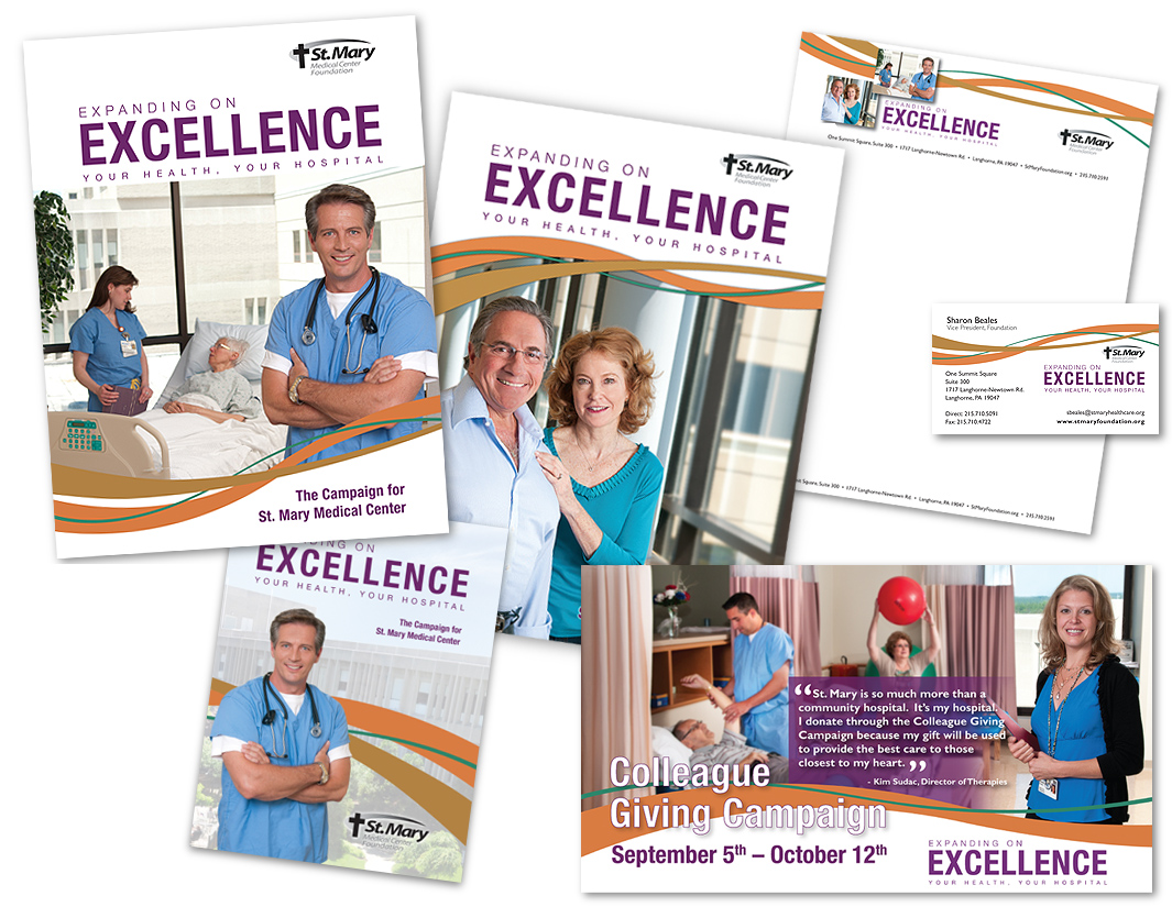
Building its first capital campaign in 10 years was a major undertaking for St. Mary Foundation. Because we had rebranded the Foundation the previous year, accent rose to the challenge to create a complementary look tied to the newly established brand. Starting with a campaign tag line, focused collateral and specific webpages, we crafted an approach that was fresh but still familiar to all.
accent had a well-established brand guideline of using real Foundation colleagues, community members and donors in all communications. But with such a large-scale, comprehensive capital campaign, how do we represent so many diverse departments?
For such a broad canvas, we hired professional models to represent a neighborhood couple and a doctor as the faces of the campaign. (You may even recognize our “doctor.” He fronted a Just For Men commercial.) When faced with unexpected challenges, we break down an issue to its core. Our team quickly finds the answers to stumbling blocks and never shies away from trying the new to make way for the solve.